Taking control of your home decor is popular these days. It allows homeowners to express their ideas, interests, and creativity. Having said all that, due to the freedom that these property owners have, they tend to push the boundaries in creating their plans. After compiling this list, we finally understand why interior designers are needed (and paid so well).
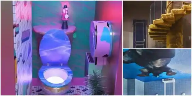
You are about to dive into some of the most horrific home decor mistakes ever made. Fair warning: they do not spark joy. From a strange staircase carpeted with human hair to a floor designed to look like flaming lava, you’re about to discover 39 ideas to avoid when decorating a house.
Stairway to Nope!
Legendary rock n’ roll band Led Zeppelin created one of the greatest songs in history: “Stairway to Heaven.” We are pretty sure they did not have something like this in mind. Seriously, what is the idea behind this creepy creation?

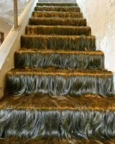
The homeowner might be fascinated by hair, but the real question is, whose hair is it? The hair looks perfectly uniform, and there’s so much of it. This is one staircase we won’t ever be taking.
Leave it at the Front Door
There are a lot of questions running through our heads right now, and none of what we’re seeing makes sense. Why did they build a door this high, and do they not think it might need stairs? What’s the logic behind this high door?


We have to admit, if we owned this house and had a package on the way, we would tell the delivery person to “just leave it at the front door.” The look on their face would be priceless as they tried to figure out how on Earth they’re meant to follow that instruction.
Taking Comfort to a Whole New Level
If you’ve used public restrooms at restaurants, schools, gyms, or offices, you will often notice posts and placards advocating for cleanliness in restrooms. As they say, having a clean restroom promotes good health.
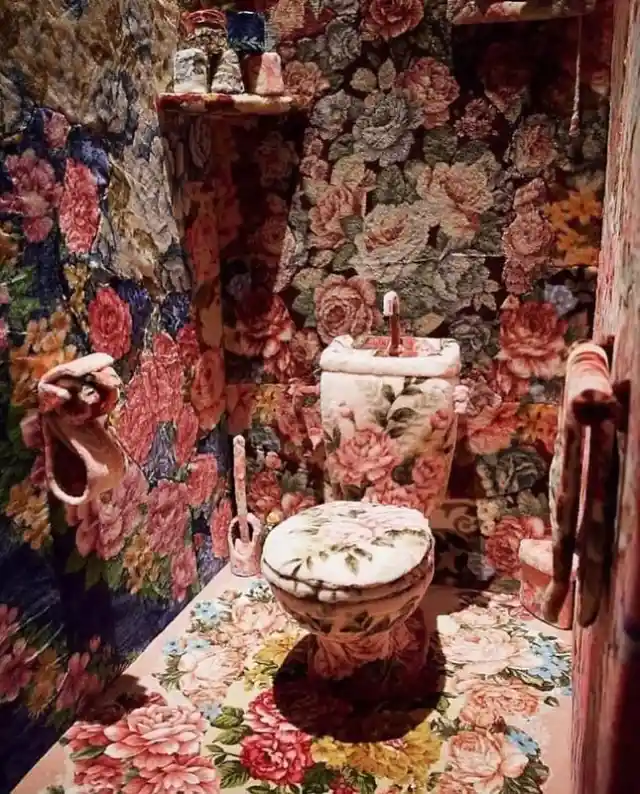

The owner of this bathroom took that quote to heart and even elevated it to a new level. The designs are certainly colorful, but we’re sure all Harry Potter fans can think of nothing but Dolores Umbridge right now!
No More Dolls, Please
A few years ago, we were introduced to multiple horror movies consisting of possessed dolls. Those movies had such a powerful impact on society that there was an appreciable decline in doll sales, especially the larger ones. Clearly, this person doesn’t fear anything.
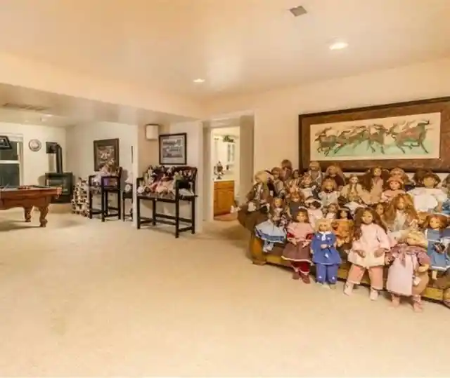
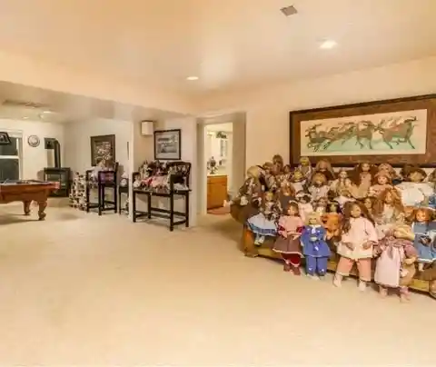
Call us scaredy-cats or sissies, we don’t care. These dolls might look innocent but as soon as darkness falls, who knows what they’re getting up to. Sorry, but we cannot bear the creepy vibes of this dollhouse.
Faucet Socket?
Upon seeing this picture, one thing comes to mind: the “you had one job” meme. Seriously, you don’t have to be an expert plumber or electrician to know the basics. Electrical sockets and faucets are not made for each other.
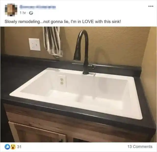

Many people have suggested that this picture is edited, and we have a feeling that’s the case. This setup is far too well put together to have been installed by someone who thinks it’s fine to put an electrical outlet in a sink!
Rugs for Days
This photo was shared anonymously by a woman on social media. She was asking for feedback on her interior design. While the room looks spacious, we keep wanting to count how many rugs are on the floor.

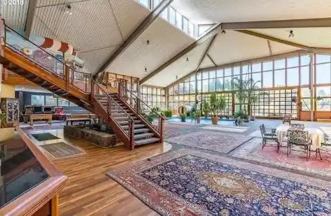
The rugs perfectly complement the floor. However, we think she went a little overboard. Perhaps rugs were on sale, so she decided to purchase as many as she could for her house.
Aesthetic Springs, Anyone?
We’re not even sure where to start with this one as we are totally confused. How valuable are those old springs that you can’t dispose of them? Is there a sentimental attachment? Or does the owner have some kind of belief system that revolves around springs?
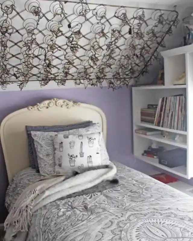
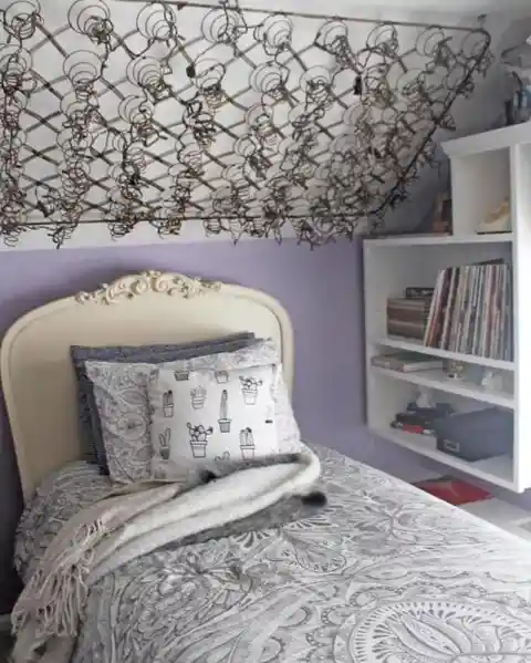
We are not artists, and we don’t have the right to question the intention behind this. However, we feel there has to be a better way to recycle old bed springs.
Whose Idea Was This?
We are pretty sure that this is not a minimalistic idea as the picture shows plenty of space and various rooms based on the doors that are opened. It looks like the owner of the house had a change of heart in the middle of the project.
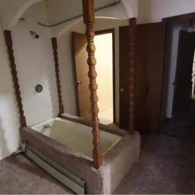
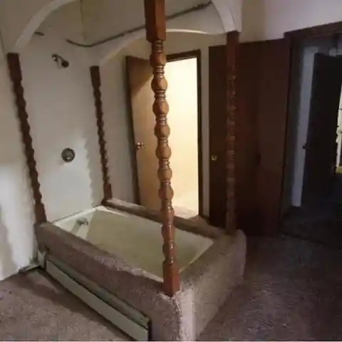
The four posts surrounding the bathtub are a clear indication that it is from old bedroom furniture. Needless to say, it’s important to plan properly before starting any project. Otherwise, you might end up with an odd installment like this.
Bathroom Redefined
Imagine this, you are in the middle of devouring some mouthwatering food and suddenly you have an upset stomach. You hurry to the bathroom and make it just in time. However, your relief fades as you realize you’re stuck in the situation below.
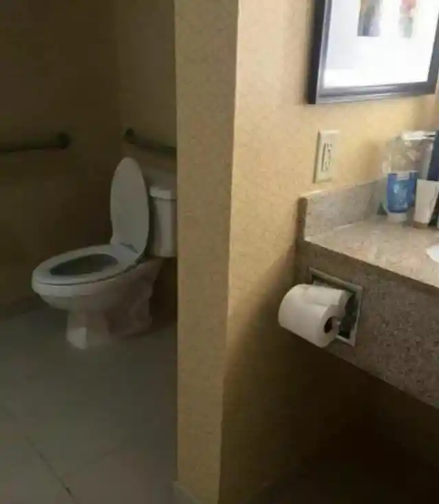
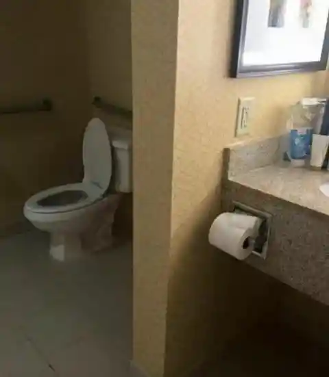
Where is the toilet paper? That would be a maddening situation to find yourself in, and that is why we would not be in favor of having this design in our home. What was the person who designed this thinking?
A Unique Kitchen Island
If only one person is living in this house, we completely understand. However, if this is a family house, we would suggest contacting a professional interior designer. The placement of the kitchen island makes it look less like a kitchen and more like the set of the nightly news.
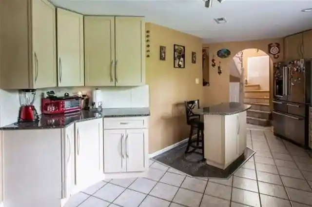

Perhaps the owner is an aspiring news anchor. It would certainly be good practice for the real deal. If you can keep calm and present the news while your family organizes breakfast, then you’ll surely handle the demands of the newsroom!
Disney-Inspired Design
This house has us wondering if Rapunzel is trapped inside. The construction might not resemble the castle Rapunzel was trapped in, but that tower bears a pretty close resemblance.

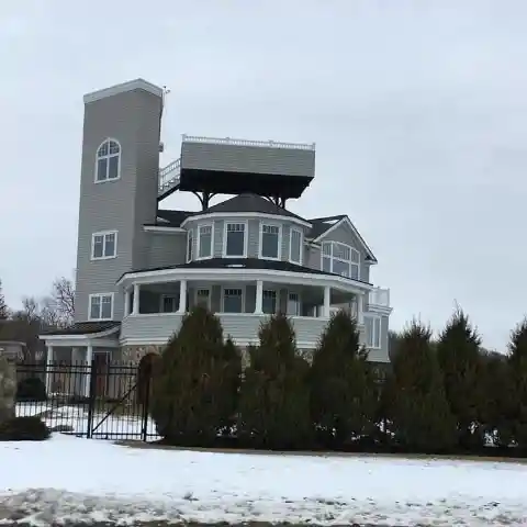
As funny as it looks, the building has been perfectly designed to hold the upper deck that was created. It may look a little odd, but we’d love to see the view from that deck, or even the top window in the tower.
A Strange Arrangement
This design might have been created before online streaming videos or Youtube. You can tell by the size of the television that the owner is a huge TV addict. For some reason, they thought that installing the laundry machines in the living room would be convenient.
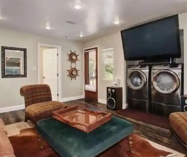

By the looks of it, this house probably belongs to an elderly couple. Perhaps they installed the laundry machines in the living room so they could spend more time together while doing chores!
The Bed of Our Dreams
This is the first feature on our list that we might consider if we ever have some extra money to throw around. Just look at how neat and comfortable the whole area is. The chandeliers look elegant, the rug perfectly matches the floor, and they even have a fireplace!


What stands out is how the bed was created with those cushioned levels. Forget going to a spa for relaxation, the bed can do that alone in an instant. The only problem we can see is that it might be a little scary sleeping with a chandelier hanging above your head!
A Decorative Door?
If you haven’t seen what’s wrong with this picture, you still have time to take a second look. Found it? Great. Now it’s time to question it. What’s the purpose of that door on top of the fireplace?
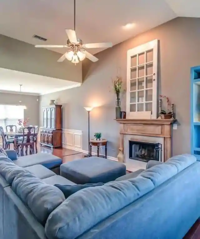

Why in the world would you destroy a beautifully designed living room with a door that goes nowhere? Does the owner know something we don’t know? Or are they just trying to repurpose the old door?
Taking Art Class Seriously
If we were to summarize what we think about this design into one word, that word would be “overkill.” There’s nothing wrong with perfecting one's craft. It takes a lot of practice and patience. Once you perfected your artistry, however, it can get addictive, and that is exactly what happened here.
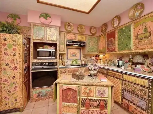

Some say that the decorations are bohemian-inspired. Others say the owner might be a nature lover due to the ferns, leaves, and flowers. Everyone else just says, “please stop.”
The Invention of the Century
Barn doors are all the rage at the moment, but not everyone can afford the installation. If you’d like to join the trend but don’t have the cash to splash around, perhaps this tiny invention may do the trick.
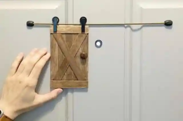

If this is a joke, we must admit, it is pretty hilarious. You can tell all your friends you renovated the house and had barn doors installed. When they come over to see, you get to unveil this!
A Heavenly House
Is there such a thing as being too patriotic? Based on the design of this house, the only things missing are Zeus and the rest of the Greek gods! There’s nothing wrong with being proud of where you came from, but this is overkill.
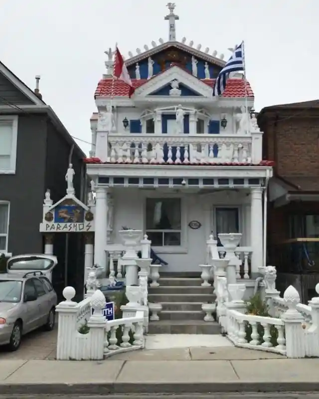
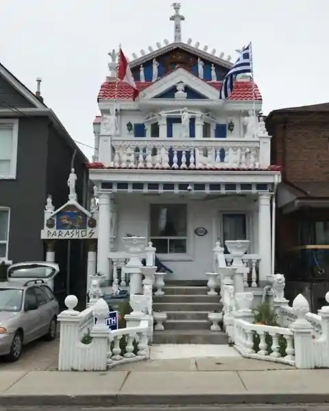
This is why the phrase “go big or go home” does not apply to everybody. The good thing about it is, their neighbors don't need to travel to Greece to have a Kodak moment.
Where’s the Mirror?
In this episode of, “Trust me, I’m a professional,” we can see that none of the designs and placements make sense. The bathroom sink looks like it can be detached by a 12- year- old. Then there’s a table cut in half and hanging on the wall supporting the mirror.

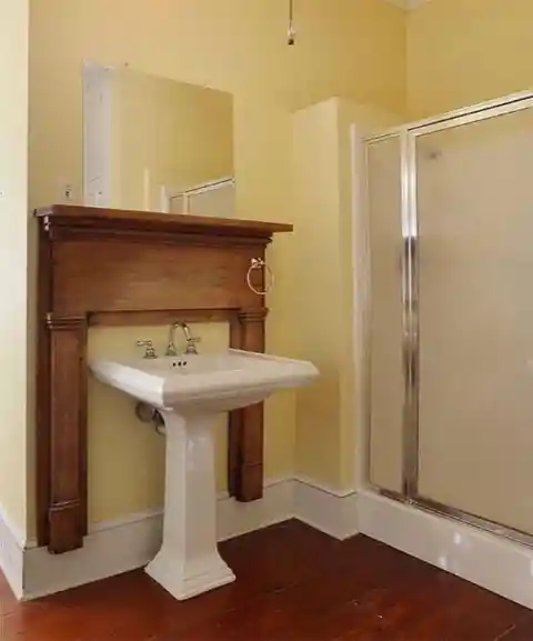
This bathroom is crying out for help from a real professional. We hope this is a “before picture” and there’s a beautiful “after picture” out there somewhere!
A Lovely Bathroom
In the third edition of, “Overkill”, obviously we can see that the owner of this house loves the color red. From the ceilings to the wall and floor, there’s no denying what the owner loves.

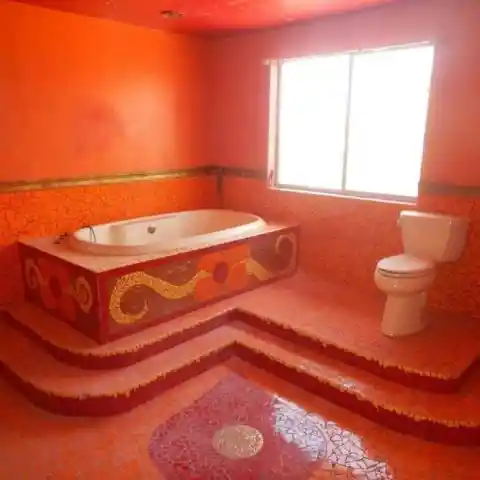
Any form of addiction can be disastrous if it is allowed to run free. This bathroom is evidence of how bad an addiction to a specific color can get. It hurts our eyes just to look at it. We can’t imagine what it would be like to actually sit in there. At least the owner loves it!
Too Cool for a Cat's House?
The way this cat's house was constructed means only two things. First, the owner loves their furball madly. Second, the owner has a lot of extra funds and time on their hands to create it. The notion that pets are part of the family is not taken lightly by some people.

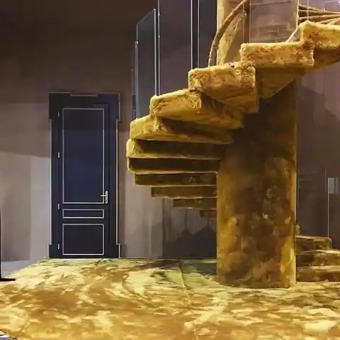
Indeed, some people will do without luxuries themselves to ensure their pets get pampered. The furballs who get to play in this mansion are living like royalty.
Decals… Decals Everywhere
While mixing and matching is a great way to come up with a unique style, it didn’t pan out in this design. The chandeliers don't compliment the area, and why does it have so many stools? Were the owners trying to recreate a bar design?
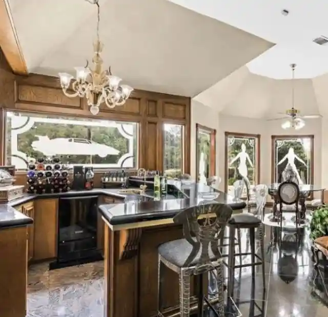
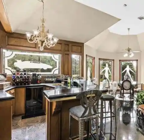
Why are there so many decals surrounding this region of the house? Is that the Delorean time machine from the “Back to the Future” series?
Repurposing Isn’t for Everybody
Repurposing something involves finding an alternative way for it to be used. The most common thing recycled is a mason jar. It can be used as a canister for your office and school supplies or it can be a makeshift container for different foods.

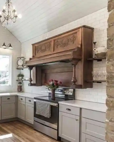
What we have here is unexplainable. Why would you put an old piano over a gas stove? How did they even manage to do it?
Wild Wild Stairs
We will try to go easy on this one. It’s not a guarantee, but we will try. The murals are astonishing, don’t get us wrong. However, can somebody explain how all the scenes depicted on the stairs are connected?
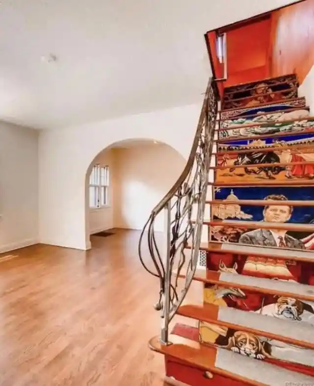

The first three steps have dogs playing pool. Next is the late president, John F. Kennedy. Then we have a matador engaged in a bullfight. After that, two sheep. Lastly, an image of Jesus Christ. These stairs are confusing, to say the least!
The Birth of Side Mirrors
Certain things go together and shouldn’t be separated. Like mac n’ cheese, peanut butter and jelly, nuts and bolts, and of course, sinks and mirrors. If you are wondering what happened to the placement of the mirrors in this bathroom, you are not alone.
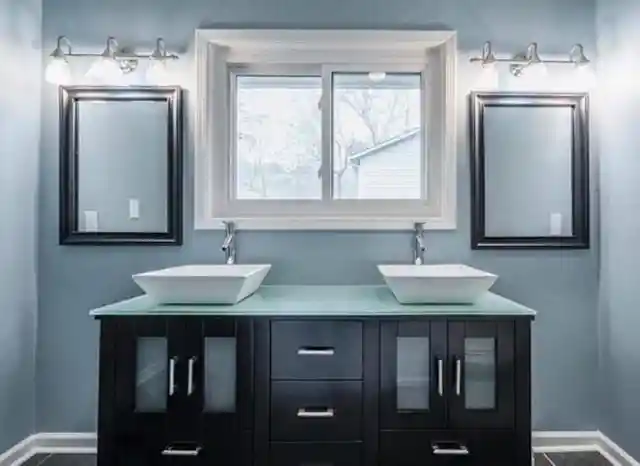
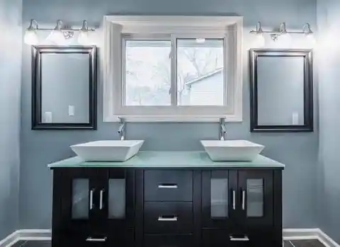
Instead of going for a wider vanity that would allow for the sinks and mirrors to be aligned, they decided to install side mirrors instead. So long as they’re happy, we guess it’s fine!
The Creepiest DIY Project
If this was done in a bar or a pub, then it would at least get a few laughs. Instead of throwing out your old jeans, why not recycle them by using them as chair decor? This idea would definitely encourage customers to come in and take selfies.
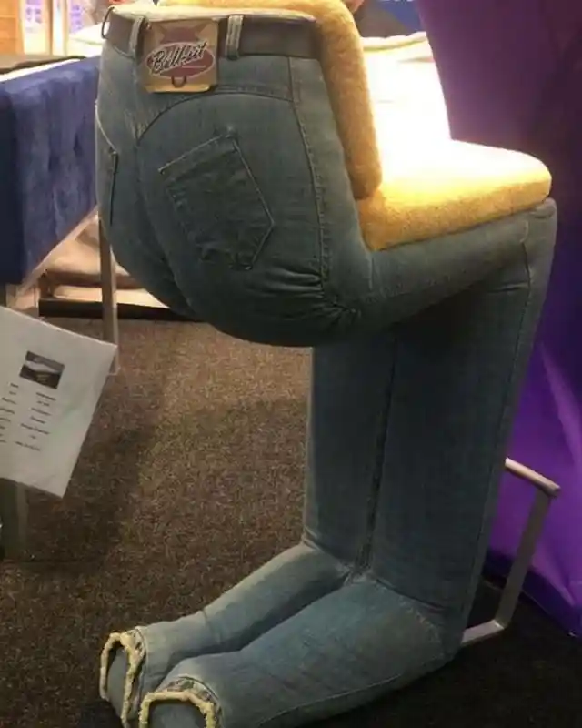

With that said, this is only applicable in a bar. We feel that the joke would soon wear off and it would just be creepy to see this contorted figure lurking in your house every day.
Why?
When people have a lot of money, they tend to do unnecessary things. It seems like the owner of this house was trying to design a bedroom that looked like a swimming pool. However, what’s questionable is the mural of an elephant on the ceiling.
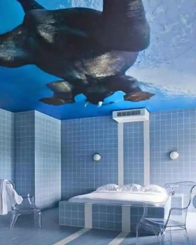

We know this is not what people mean when they speak of the “elephant in the room.” However, nothing else comes to mind to explain this odd design. Is it common for elephants to swim in man-made pools?
Somebody Loves Fishing
Whoever owns this house is clearly a fan of ice fishing. We wonder if they got approval for this design from the other members of the household.
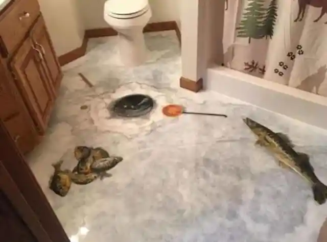
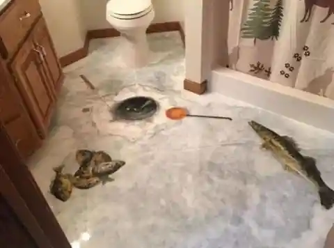
The painting looks phenomenal and realistic. However, if you were a guest in the house, this might make you scream or shake your head. There's no in-between – you either love it or hate it.
How Do You Sit in Those Chairs?
Some people want to be unique so badly, they are willing to ruin their homes in the process. We only have two questions here. First, how many people are there in the household? Second, how is anyone meant to sit in those chairs?
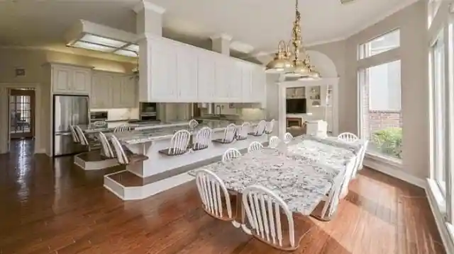
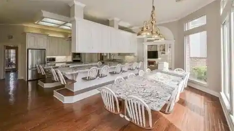
Did they even talk to each other before executing their plan? This looks like the old bench or chair design from gasoline stations in the 1950s. Our question is this: Where are your legs meant to fit?
Just Throw Them Away
Here’s another repurposing idea that went wrong. Certain things should remain in the box, in the attic, completely untouched. This might not be real to some, but some things seem to be possessed by dark magic, especially antiques.

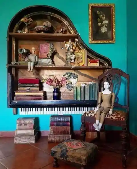
While they did a great job with the piano shelving and the old books, the wooden dolls and the face beside the vase are unsettling. A friendly suggestion: Why not just throw those creepy things away?
Tribal Bathroom
Based on the picture, the statues seem to come from one of the tropical islands in the world. They are well-preserved works of art. The one thing we’re not sure about is whether they really belong in a bathroom.
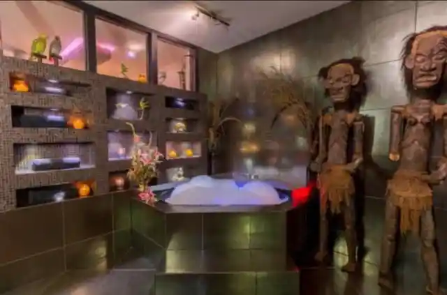

Taking an hour-long bath should be relaxing. Sometimes, it can even make us drift off to sleep. Waking up surrounded by angry-looking tribal statutes would be a nightmare!
An Intense Kitchen
Overall, the design of this house was carefully planned and executed. The vibe is somewhat regal, and it is a design that we’re sure some would love to replicate.
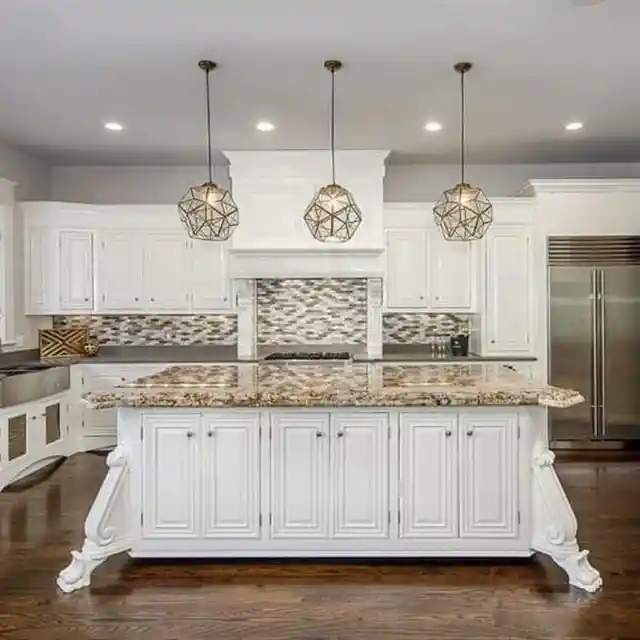
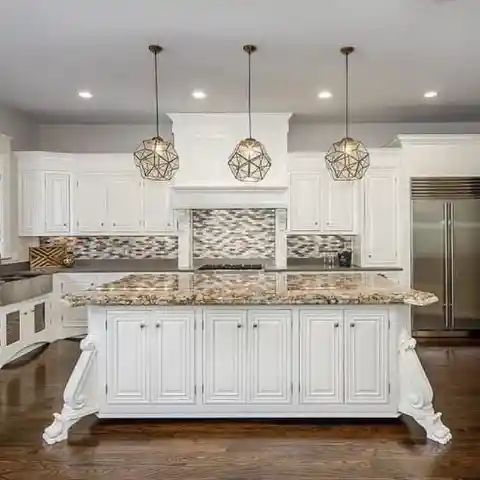
The main problem we have here comes in the form of those table bases. If you think hitting your toes to the edge of the cabinet hurts, hitting one of these will make you say every curse word in a matter of seconds. You’ll want to have good health insurance before stepping foot in this house!
Reviving the 80s
Have you noticed that some of the retro styles are coming back? From fashion to vinyl records and even the old ice cream parlor shops, it is great to see these things again.
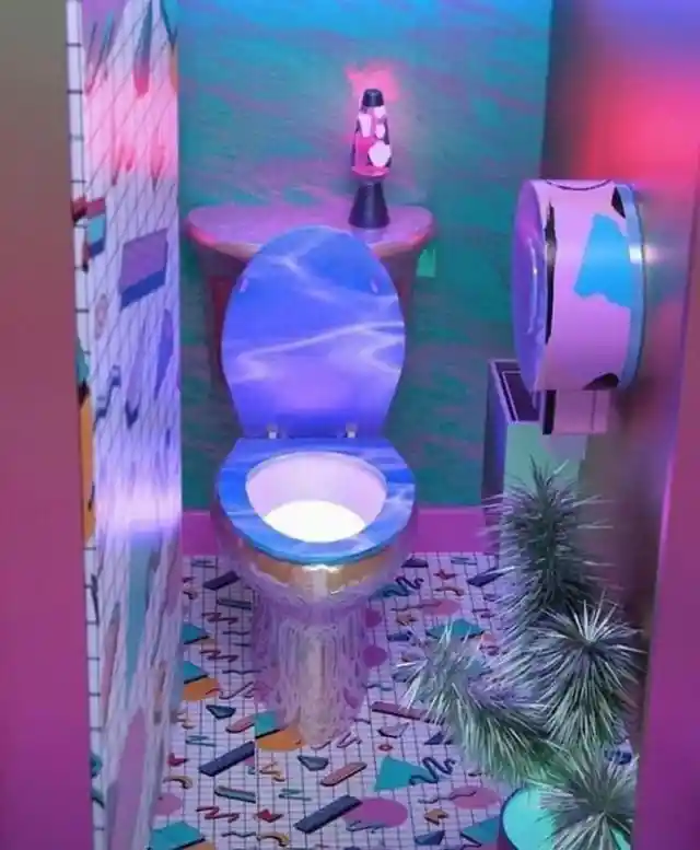

However, there should be a limit to what can be brought back. Sure, you miss the 80s, but it’s a bit much to design your bathroom with every 80s pattern ever invented. Even Madonna wouldn't grace this throne.
A Real Estate Blunder
It's sad to see things that are mishandled and wasted due to negligence and people trying to do too much all at once. For instance, this spacious room could have been magnificent. There are a lot of amazing designs that could have been created with some professional help, but the owners decided to do it on their own.
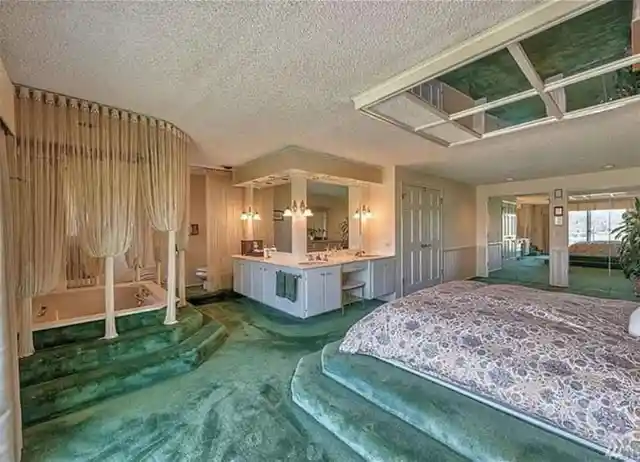
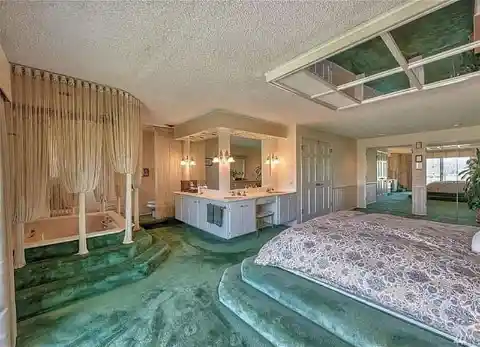
Just look how bad it is. There’s no privacy at all from the bedroom to the bathroom. Why can’t the owner install walls? Have walls gone out of style?
And It Was All Yellow
Just to be clear, we think this is much better than the red bathroom that we introduced a few slides ago. Still, it contains basically the same issue. Too much of anything is never a good thing. Yellow is a bit more mellow than red, but it’s still intense when it’s the only color in the room.

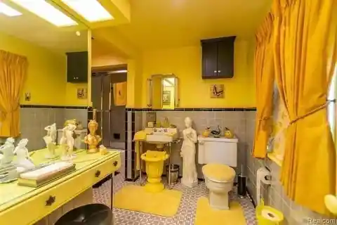
Some say it is majestic, and they might be right. The longer you look at this bathroom, though, the more it hurts your eyes. Adding another color wouldn’t be that bad.
An Ethereal Toilet
There’s an ongoing debate with this picture surrounding whether or not the owner used real butterflies encased in resin or just stickers. Regardless of what they’ve used, this is not pleasing to the eyes.

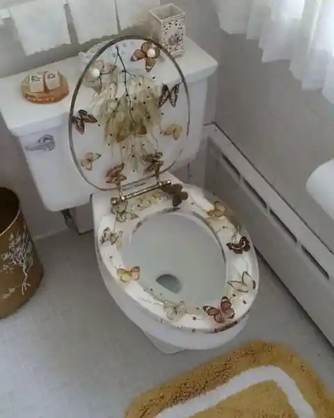
Yes, it might look cute the first time you see it, but the same goes for the mural of fish painted on the bathroom floor. It’s not the kind of thing you want to see every day. Sure, the homeowner might love butterflies, but can they not show their affection in any other way, like putting them in a frame?
When a Simple Design Isn’t Enough
Margaret Wolfe Hungerford once stated, “Beauty is in the eye of the beholder.” Evidently, we aren’t the beholders destined to see beauty in this design. In fact, we don’t even see the purpose of it. If the goal is to scare visitors away. then the goal has been achieved. Despite checking all angles to verify the point of making this, we are lost for words.

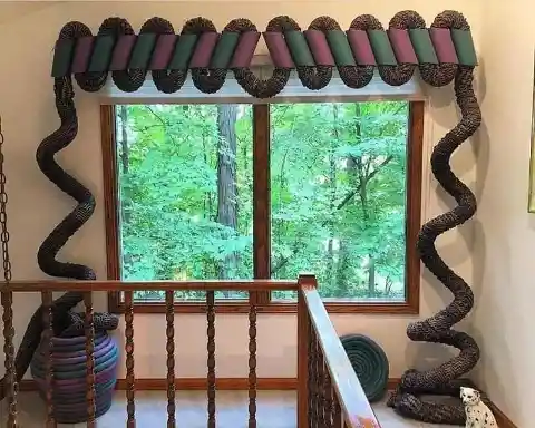
Is it a giant snake? A giant worm? Only the owner knows, and we are optimistic that they have a good reason behind this.
There’s Still Time to Redesign
It’s not hard to identify that the owner of this house is a nature lover. The ceiling is completely covered with pine needles and pine cones. It looks like they are in a cabin. While there’s nothing wrong with the design, the placement of the chandelier with the fake candles bothers us the most.
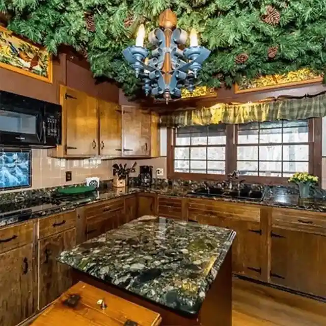

Also, prior to decorating the ceiling, the owner must have been aware of insects and arachnids. Those pine needles offer far too many places for creepy crawlies to hide. It’s time to redesign that kitchen!
For the Love of Cows
If this design was created for an advertisement or manufacturer of cow products, then they’d have our vote. Look how well they were able to maximize their kitchen. The owners of this house probably love cows so much they’ve decided to put one on a mural.
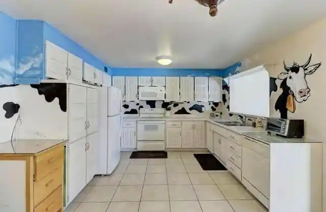

As crazy as it sounds, this is way better compared to some of ] the other designs we’ve just seen. This isn’t a design we would consider in the future, but it’s not the worst thing in the world!
Whose Idea Was This?
The last entry on our list is a doozy. Without the barn door, the house is perfectly conceptualized. Again, that is without the barn door. However, what we are seeing is another structural failure that could have been avoided through proper planning.

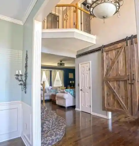
Not only have they installed an unnecessary barn door inside their house, but the gap between the door and the floor is also way too large. Apart from that, it looks like the tracks will take one of the barn doors over an existing door. All in all, it’s a mess!