Companies dedicate a considerable amount of money to advertising since it is the best way to spread the news about your brand, products, and services. Of course, it takes more than money to create a successful ad campaign. We’re hit with so much advertising every day that companies need to come up with creative and unusual ideas to cut through all the noise. Many companies provide similar products and services, so to stand out, you have to be a maverick.

Though some of them are downright annoying, ads offer an incredible way to reach your target audience. When handled well, they can have an incredibly positive effect. To get your creative energy flowing and to brighten your day, we have gathered some of the most impressive bus ads from all over the world.
Yep, Always First!
The department of logistics is loaded with rivalry, and if you're not quick enough, you will fail. FedEx's "Alway First" slogan appears to have hit the right note with its target audience.
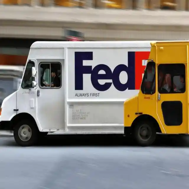
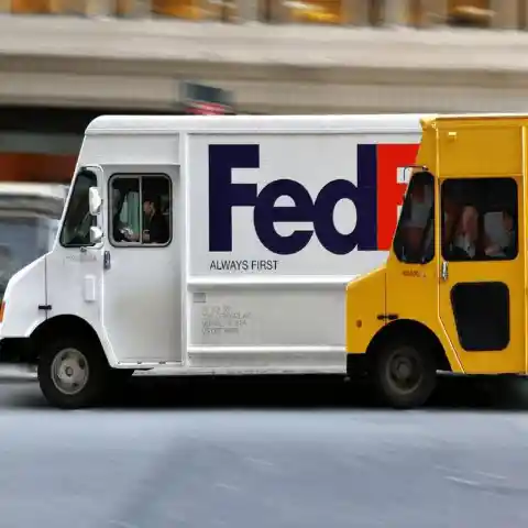
In addition to showcasing their recognizable white truck, FedEx has taken the opportunity to have a subtle dig at their rival, DHL. The front wheel of their yellow truck is lined up with FedEx's back wheel, inferring that the rival will never be as efficient as FedEx.
A Zoo on Wheels
These days, there are countless attractions that will be overlooked by potential customers if an effective ad campaign isn’t carried out. With that said, Canberra’s National Zoo and Aquarium came up with a clever way to get people back to the zoo.
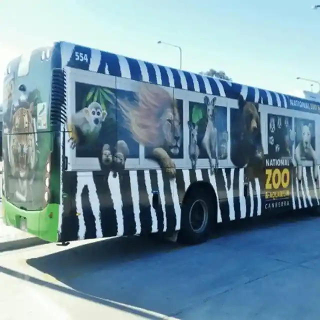

Their bus ad features an assortment of creatures enjoying the ease of public transport, including kangaroos, birds, and bears. If you end up driving by the bus with kids in the vehicle, we’re sure you'd hear no end of it until you took them to the zoo!
Hard at Work
Monster.com is a site that connects employers with job seekers. To get people to utilize the platform, the global employment website took out ad space on a multi-level bus.
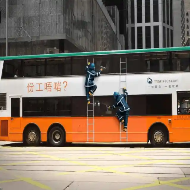
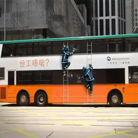
The detailed design makes it look like two men really are up there cleaning the windows. It came with a slogan that said, "Stuck in the wrong job"? We bet they had a flood of new users after the campaign.
An Innovative Ghost Rider Bus Ad
How do you communicate the vibe of a film in just one image? The team who were accountable for showcasing the film Ghost Rider hit a homerun with their imaginative bus promotion. Take a look at the bus wrap below, and you get the concept that the film has amazing visuals and special effects.


We're certain this boosted the film’s box office success, with crowds flocking to theatres across the country. The marketing firm sure worked hard on this one.
Kiss, Kiss!
Placing ads on buses can be complex. Get it wrong, and you can ruin an expensive ad campaign. Get it right, and you will have astonishing results. Take the image below, for example. Smint breath mints had great success with their sliding door advertisement.

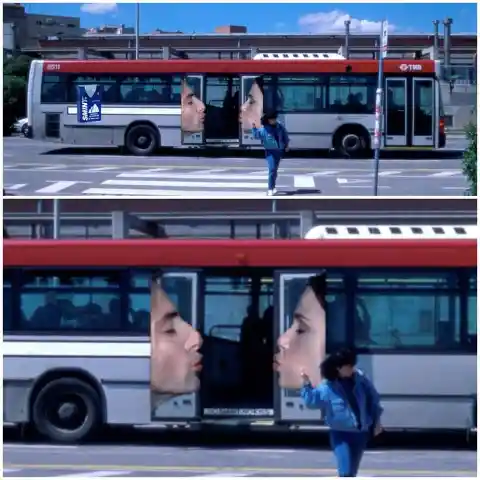
Every time the bus doors close, the couple on the doors look like they’re kissing. In our minds, this is as clever as it is adorable. What do you think?
Snakes on a Bus
Here is the second (and not the last) zoo advertisement you will see on this list. It’s easy to forget how amazing the zoo is, but Connecticut's Beardsley Zoo clearly didn’t want to be forgotten.

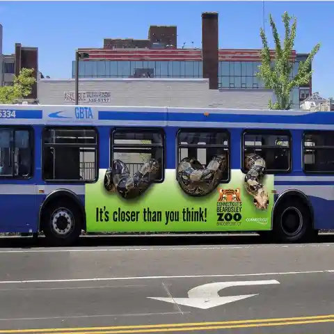
They made a clever illusion of a monster snake crawling in and out of the bus, but don’t freak out, there's no risk here. Nor is there any danger at the zoo. You may see an assortment of dangerous creatures, but they’ll all be safely tucked away in their enclosures.
Flights of Fancy
This airline came up with a clever way of letting people know that air travel isn’t as expensive as they might have assumed. This ad places bus passengers in a window that makes it look like they’re flying high.

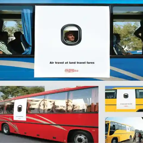
This ad campaign instantly communicates to any passers-by that their dreams of traveling the world may not be so far-fetched. The best thing about the advertisement is that it is impeccably positioned to show the traveler's face for people in the city to see. We bet this led to a lot of exchanged smiles.
Who Let the Dogs Out?
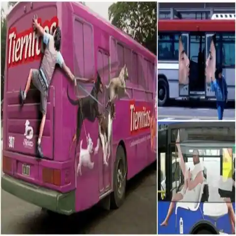
This promotion is in Spanish, so for the people who don't speak Español, Tiernitos translates to "little cuties." When you see this bus advertisement, you instantly understand that it has something to do with dogs.
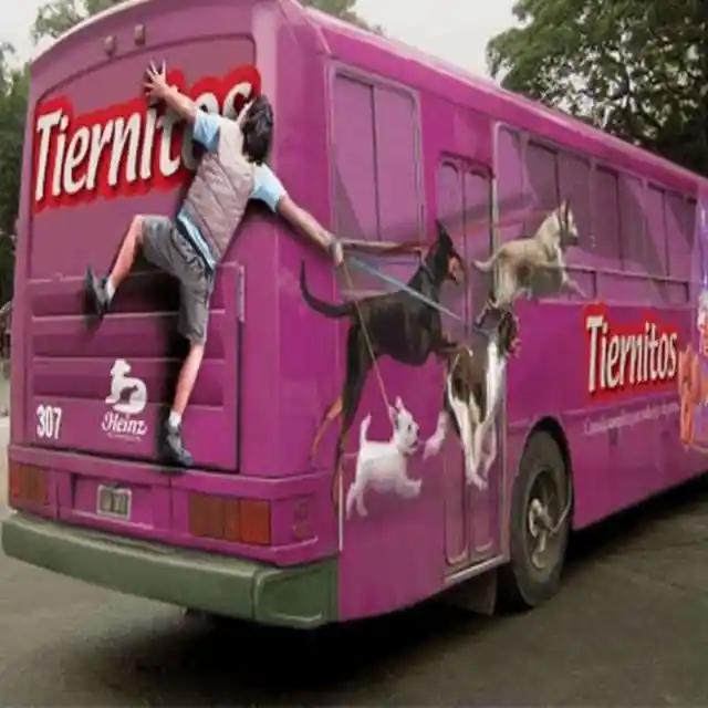

It features a man clutching the rear of the bus, attempting to walk four pups that are chasing after Tiernitos dog food. This promotion is an extraordinary effort to get pet owners to try the brand. Tip: If you're taking that many dogs out for a walk, you’ll need a lot of upper body strength to keep them under control!
Who Flipped the Bus?
Ben & Jerry’s is a premium ice cream brand known for its quirky flavor names. Remember Netflix & Chill, Minter Wonderland, and Cherry Garcia? Such titles capture consumer attention, helping the brand stand out from the competition.

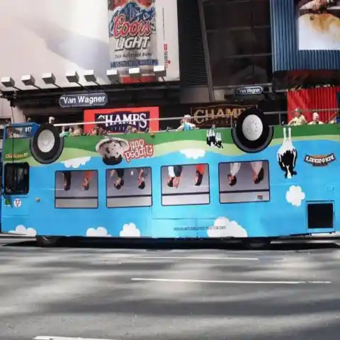
To make a buzz about Flipped Out, their newest ice cream flavor, they covered the bus with a wrap that made it look like it was upside down. What a clever concept for an ad!
Jumbo Mars Bar, Anyone?
Since 1932, Mars Bars have been satisfying America’s chocolate cravings. To remain significant and keep up with its rivals, the company came up with an ingenious method to help consumers remember its chocolatey goodness.

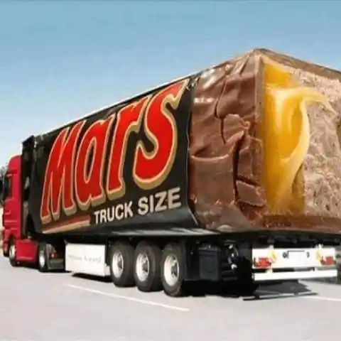
The truck's shape mimics that of the chocolate bar impeccably. If ever we saw a monster, truck-size Mars bar out and about, it would definitely make our mouths water and inspire us to stop at the closest store so we can stock up.
Flying High
With the travel industry resting as a result of the pandemic, many are eager to go on a trip as soon as circumstances allow it. Although this advertisement by Air New Zealand was launched a couple of years ago, we figure it would be a knockout in the post-pandemic world.
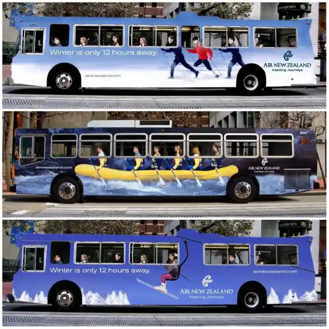
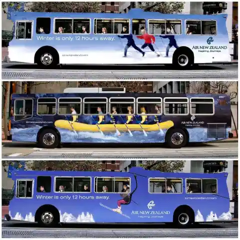
Air New Zealand concocted a couple of connected advertisements for buses. They show all the incredible activities travelers can anticipate when they fly with the airline. This makes us want to book our tickets now.
Meet The New Batmobile Bus
Directed by Christopher Nolan and starring Christian Bale, the Dark Knight trilogy was a box office smash. Ben Affleck had large shoes to fill with Batman vs. Superman: Dawn of Justice. Unfortunately, the film didn’t quite live up to expectations.
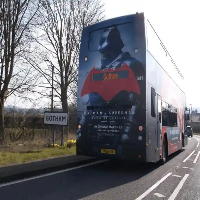
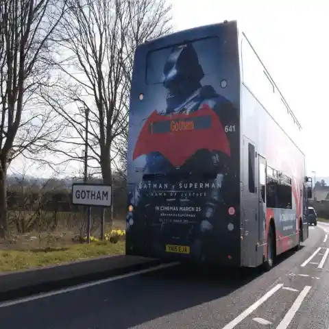
Though this bus advertisement is different from other promotions on this list, we think its cleverness warrants a mention. Notice that sign on the left? It seems the bus really is going to Gotham!
The X-ray Bus
More often than not, we have no clue about people's opinions and what sorts of things they have hidden in their pockets. Do people on the bus have dangerous gear tucked away in their bags? Of course, if you read the text, this isn’t quite what the ad campaign was getting at.
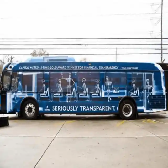

The ad does give you an idea of what it would be like to have x-ray vision. However, the bus company was using it as a way to reference the fact that they are transparent with their annual reports and financial information. We have to say, it is a unique approach!
Aladdin on a Bus?
Before the live-action adaptation of Aladdin was released in cinemas, there was a lot of talk about who was going to take on the characters of Aladdin and Jasmine. Walt Disney Pictures did a lot of work to build the mystery.
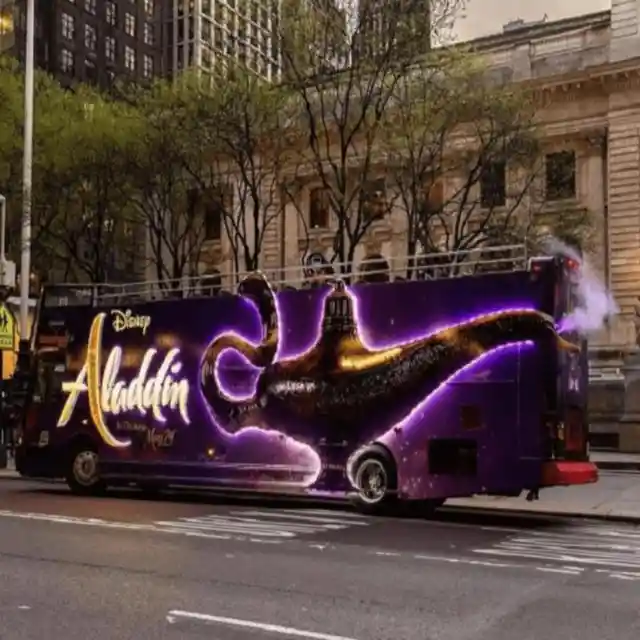
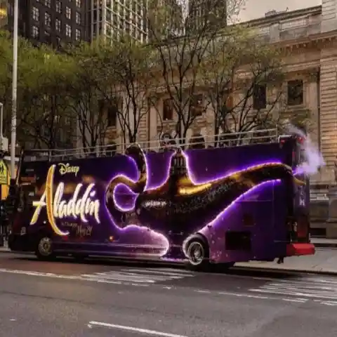
To give the bus advertisement some magic, the marketing team perfectly aligned the lamp's mouth with the exhaust pipe! This gives the illusion of an actively smoking lamp (and the hope of seeing Aladdin on the bus).
A Kid-friendly Safari
Kids are a fundamental demographic to advertisers since they have significant buying power. At the very least, they affect their parents' purchasing choices since they will often cry and pitch fits until they’re given what they want. This bus promotion for a family-friendly safari activity puts the emphasis on learning.
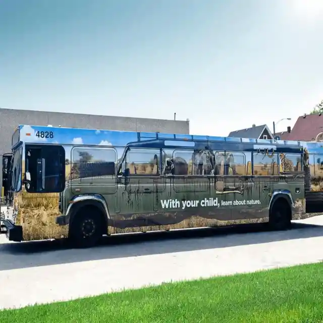

Putting the whole safari on the side of the bus helps parents envision themselves in the vehicle with their children appreciating nature. We’re excited to join the fun too!
The Flexible Bus
Wordplay, typography, and visual effects were all brought together to create this clever advertising campaign on the side of a city bus. If you need to be seen, the side of a bus is the place to be, but it’s essential that your ad is as compelling as the one in the picture below. Banks aren’t generally known for creating eye-catching or creative ads, so this credit union has really raised the bar.

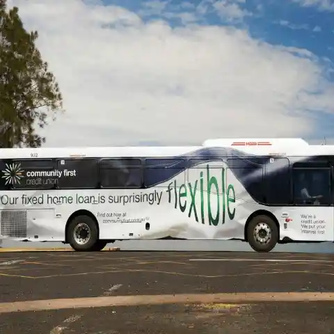
All things considered, savings accounts and mortgages are not the most interesting subjects. Nonetheless, this bus draws the eye thanks to how twisted and crumpled it looks. This flexible design did an excellent job of catching the attention of potential customers.
Keep Your Distance
There’s no way anyone will ever tailgate this bus. The advertisement is far too shocking. This particular promotion attracts attention in light of the fact that it appears as though there is a vehicle sticking out from the rear of the bus. In this case, it seems that it’s not a company trying to promote its brand with the ad. It could be an ad for an insurance company, but we think it’s more likely to be a government campaign designed to inspire safer driving habits.

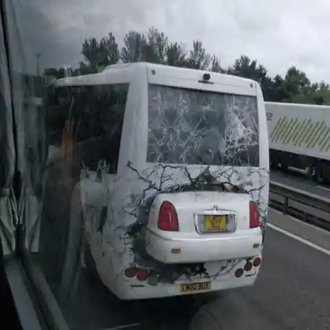
There are no words, just that graphic recreation of a fatal accident. It passes on the message perfectly. Drive cautiously or get into a mishap, and if the accident happens when you have no insurance, you will be in enormous trouble.
The Message is Loud & Clear
This promotion on the rear of the bus seats is blunt and direct. It emphatically cautions that vandalism won't go unpunished, and the people who are caught will be hit with the full force of the law.
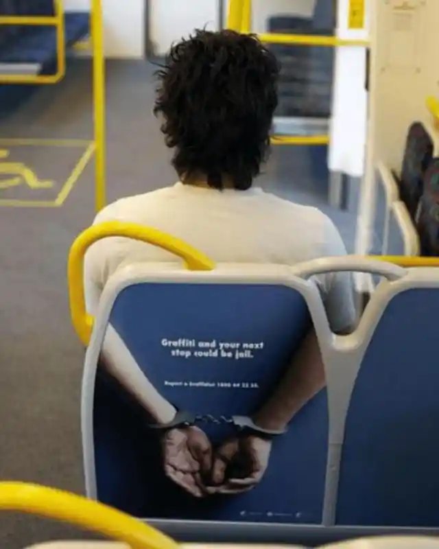

The traveler's physique in this photograph is impeccably lined up with the size of the advertisement, and his arms are in just the right place. At first glance, the guy seems as though he is handcuffed. This is another illustration of a clever campaign that’s been expertly executed.
Time to Shed Some Pounds
This promotion is admittedly a bit tacky, but it's also quite clever. Weight Watchers offers a range of products and services designed to help people with weight management. They’ve hit their target market right where it hurts with this bus advertisement.
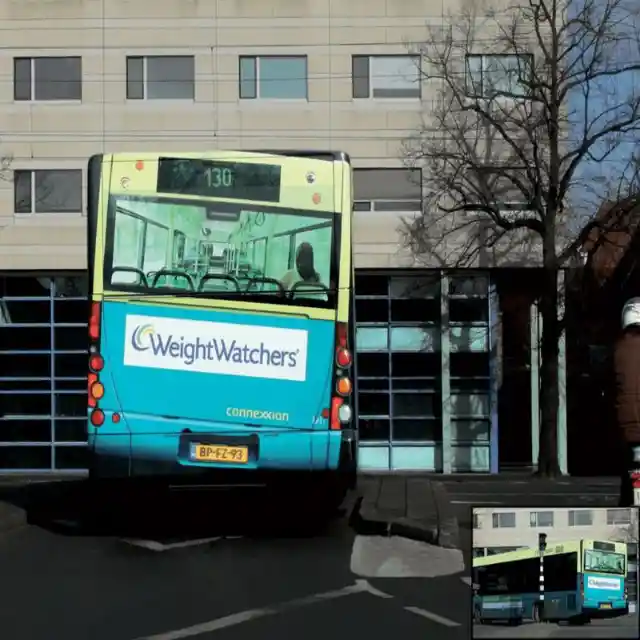
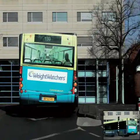
Say what you will about it, the message is abundantly clear. If you think and feel that you're over your desired weight, this ad suggests it may be time to shed a couple of pounds. If you’re curvy and loving it, then you can have a giggle and drive on.
Crushed Bus
A film as huge as King Kong wouldn't be brought to life without the utilization of special effects. The epic proportions of the film were perfectly captured in the ad campaigns. Indeed, the team behind it pulled out all the stops with their creative bus displays.
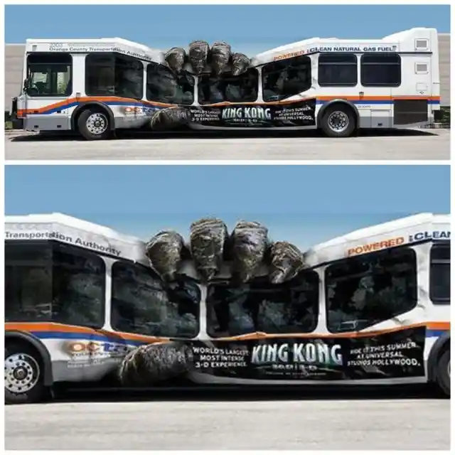
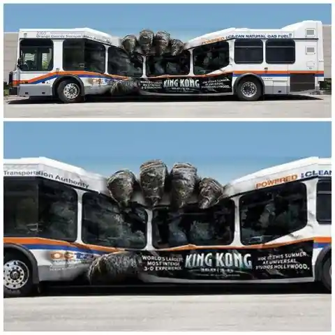
The ad agency behind this brilliant idea deserves a lot of credit. This goes above and beyond the advertising we usually see for films. The bus looks like it’s being squashed by King Kong's hand. This makes you want to go to the theater so you can see the special effects in all their glory.
Release the Kraken
This has nothing to do with the amazing beast that showed up in The Pirates of the Caribbean. It is an ad for an energy drink. The brand's mascot is the famous monster octopus that pulls boats and mariners down into the murky depths of the ocean.
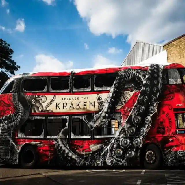

Though the ad looks amazing, it’s not immediately apparent that it’s about an energy drink. This leaves people to make assumptions, and hopefully, develop enough curiosity to look up the brand. It’s a bold move, and in this case, it paid off.
A Bright Concept
Duracell, the American manufacturer of smart power systems like alkaline batteries, had a cunning idea for advertising their new flashlights. Their marketing team positioned their signage to make it appear as though the headlights of the bus are running on Duracell power.
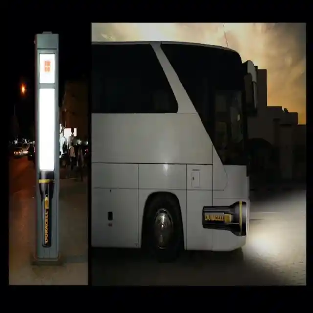

They applied a similar idea to the schedules at the bus stops. Drivers, passengers, and pedestrians were all amazed by this ad campaign. The creative people behind it deserve an award.
Music on the Bus
We don't know whether this is a promotion for a product or service as there is no slogan or organization name, but we think it may be one of the most inventive bus designs out there. It creates an amazing illusion by utilizing portions of the bus.


This is an accordion bus, so this may be the company’s ploy to make it look more appealing to potential passengers. Whatever the motivation behind this imagery may have been, we think the end result is brilliant.
Wear It, Watch It
In contrast to the other promotions on this list, the ad below can't be seen from the outside of the bus. It is smaller and subtler but still sends a clear message. Using these handles to promote a watch brand and model was a stroke of brilliance. When you put your wrist through one of the handles, it appears as though you are wearing the new watch.
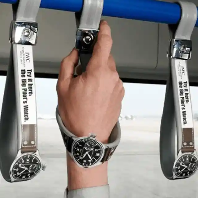

This strategy makes the promotion feel personal for travelers. They get to hang on for security while seeing how they’d look with a stylish new watch. Would this make you want to purchase a watch?
Shark Attack
To rustle up interest and expand its Shark Week audience, the National Geographic Channel came up with a clever way to make people pay attention to their bus ad. The format was perfectly executed, with the bus entryway turning into the shark's mouth.
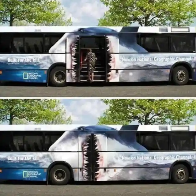
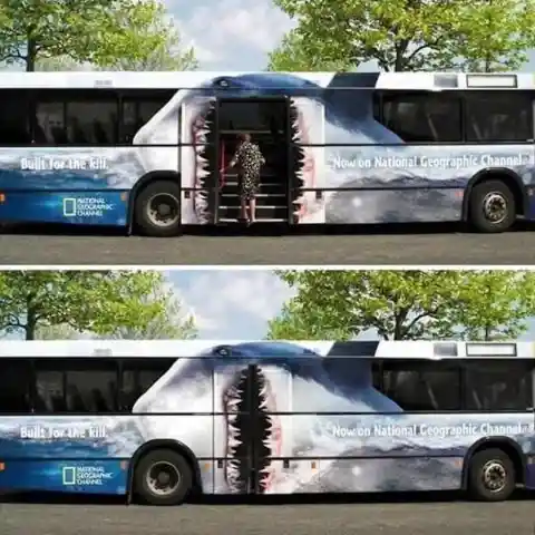
When somebody steps into the bus, it looks like the shark is being treated to another feast. This is an astounding marketing idea, and the people behind this promotion should be given a generous bonus.
The Best Way to Promote Spectacles
What do you believe is the perfect method to promote optical services? Specsavers tracked down the best formula. The plan was executed immaculately, and at first glance, it seems that the bus driver needs assistance with his depth perception. The advertisement on the back of the vehicle makes it look as though it has smashed into a sign.
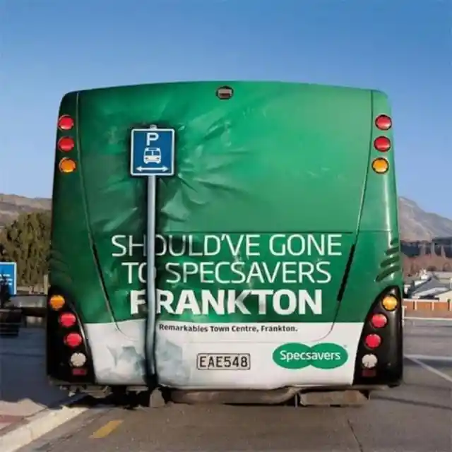

Two things will spring into your mind when you see this bus ad – you need to be extra careful when driving in reverse, and you need to visit your eye specialist soon for assessment.
Please Maintain Cleanliness
The Netherlands is famed for being one of the world’s cleanest and greenest places. When you visit the country, you will be astonished by just how spotless the urban areas are. To remind people not to litter on public transport, the local government came up with the clever idea you see below.

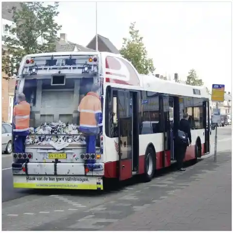
You don’t even need to be able to read the sign to understand the message, and this is how the most effective ad campaigns work.
Watch Stranger Things Now
Needless to say, Stranger Things is one of the most well-known shows on Netflix. Set in the 1980s in the fictional town of Hawkins, the series blends sci-fi, horror, comedy, and mystery into the investigation of a twisted world known as "the upside-down."
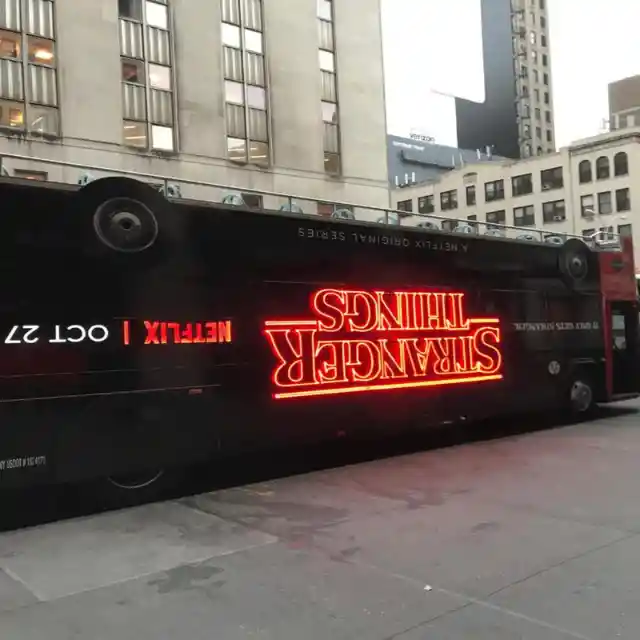

To get people intrigued, Netflix came up with a promotion that made the bus look as though it is upside-down. Somebody who doesn't have a clue about the show would watch it after seeing the bus ad.
Keep Your Teeth Clean
With all the toothbrush brands on the market today, companies need an imaginative plan to stand apart from the rest. Dr. Best used an accordion bus to promote their flexible toothbrush. If you need to accentuate flexibility, this is the ideal approach.

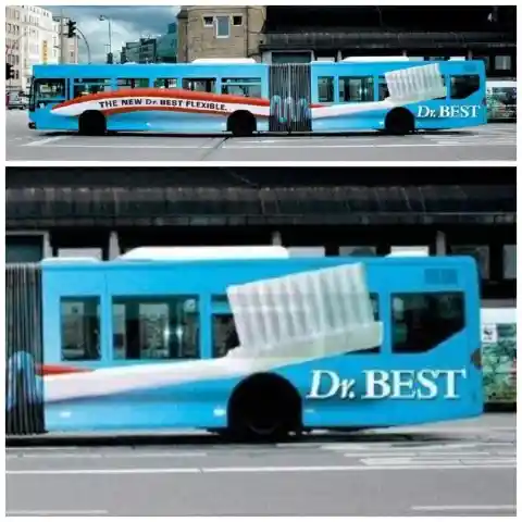
The name alone makes us want to purchase all our hygiene items from Dr. Best. Simply seeing this bus pass by is sufficient for us to be interested in the brand’s toothbrushes.
An Unmissable Elephant
Horton the Elephant is a big-hearted character from Dr. Seuss' books Horton Hatches the Egg and Horton Hears a Who. This adorable promotion for the film accentuates Horton's weight by making it look like the bus is getting squashed.
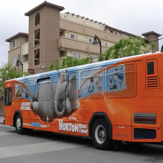
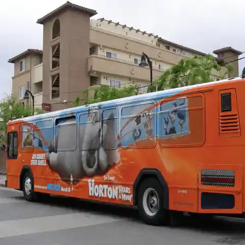
You can see the names of the main stars, two exceptionally well-known comedians, printed on the bus beside Horton’s feet. Though we can’t see his name there, Seth Rogan appeared in the film too. Given its spectacular cast, no one was surprised that Horton Hears a Who was a hit in cinemas. Seeing Horton being this adorable makes us want to go and watch the film again!
A Message That Stirs Emotions
How do you tug at people’s heartstrings? At times, it is better to utilize just a few words with a powerful picture. That was the approach taken by the people who designed the ad campaign below.
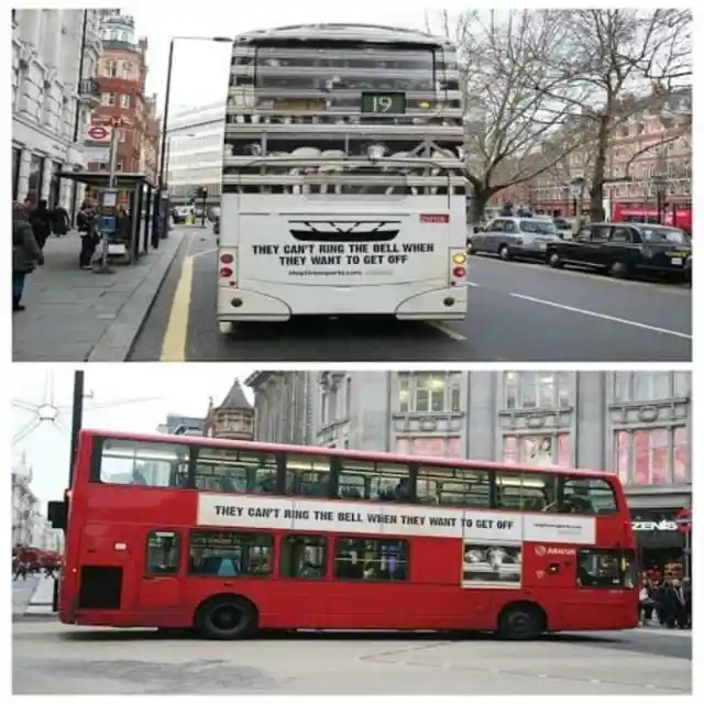
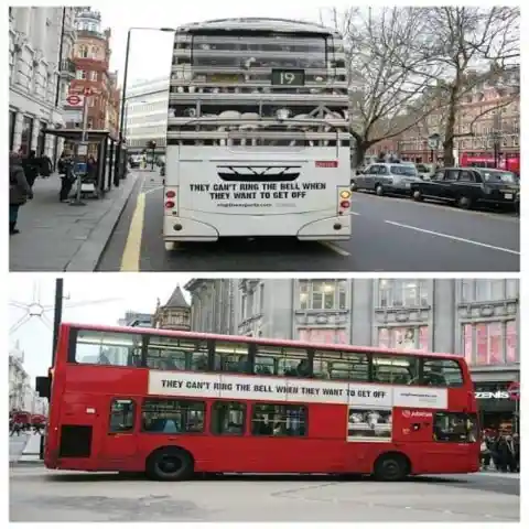
In a bid to teach people about compassionate farming, this company wrapped buses with pictures of captive animals and a message that says, "They can't ring the bell when they want to get off." The advertisement encourages people to take action by refusing to support unethical farming practices.
Glow in the Dark Bus
When you're promoting something innovative, you need to do it in a way that’s never been done before, which is what Mercedes did when they wanted to advertise their Night View Assist, a new component on their vehicles that makes night driving easier.
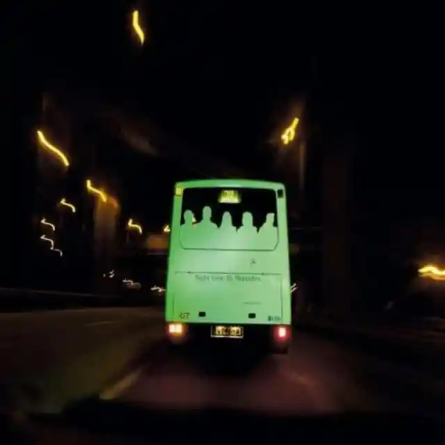

Pedestrians and other potential dangers are more noticeable to the driver, decreasing the chances of getting in an accident. To emphasize this, Mercedes applied glow-in-the-dark outlines to the back windows of city buses.
The Power of an Energy Drink
This would be a terrible way to power a bus, though we have to say, it would probably be better for the environment. To promote the X4 energy drink, this advertising agency came up with an unusual idea. The advertisement certainly gets the message across.
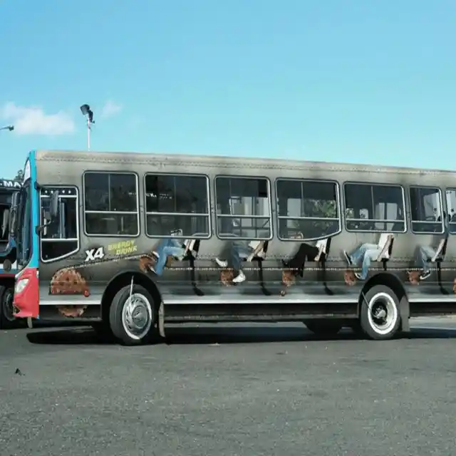
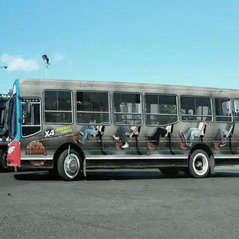
It shows travelers cycling hard to power the bus, and if that doesn't display how incredible the energy drink is, we don't know what would. We’re heading to the nearest grocery now to buy some drinks!
Get Your Morning News Fix
News is all about timeliness, so like hound dogs hunting their prey, reporters have to be hot on the trail of the most recent occurrences around the city. This is the message The Dallas Morning News wanted people to get from their bus promotion.

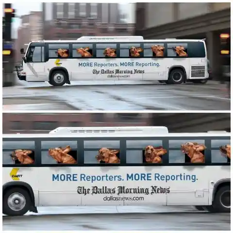
Hound dogs are known for finding a trail and refusing to give up until they’ve found what they’re looking for. Apparently, The Dallas Morning News hires reporters who are just as dogged and determined.
Say Cheese!
There are numerous approaches to using bus space for promotions. This camera advertisement has hit the right spot. It cleverly utilizes the bus wheels by transforming them into the lenses of a camera. Who knew lenses and wheels looked so much alike?
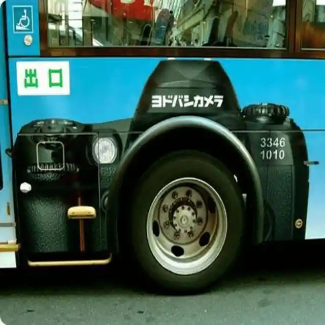

Inventive campaigns like this can promote your product so well that you leave your competition behind. Just hire the best advertising firm, and you’ll be good to go. Don’t forget to smile – you’re on camera!
Shape Up
Bus advertisements are great for sending a powerful message to potential customers. They offer a benefit that other platforms don't have – the ability to get more eyeballs on your ad since they never remain in one spot for long. This advertisement for Trimax utilizes the back and sides of the bus to promote their health products.
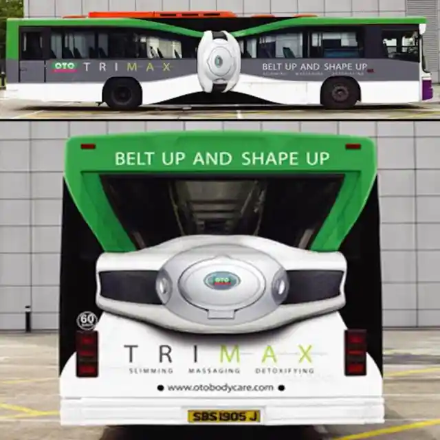

Even if you haven't heard of the brand previously, this style of advertising will certainly leave a lasting impression. Though you don’t learn precisely what the product does or how it delivers results, its benefits are clear, and this is enough to make you want to learn more.
Skating on The Bus? Yes, Please!
Here’s another clever brand integrating the bus wheels into their ad campaign. This image was designed to promote a competition called the Real Street X Games. If you’re a non-skater, we’ll forgive you if you don't recognize the competition.
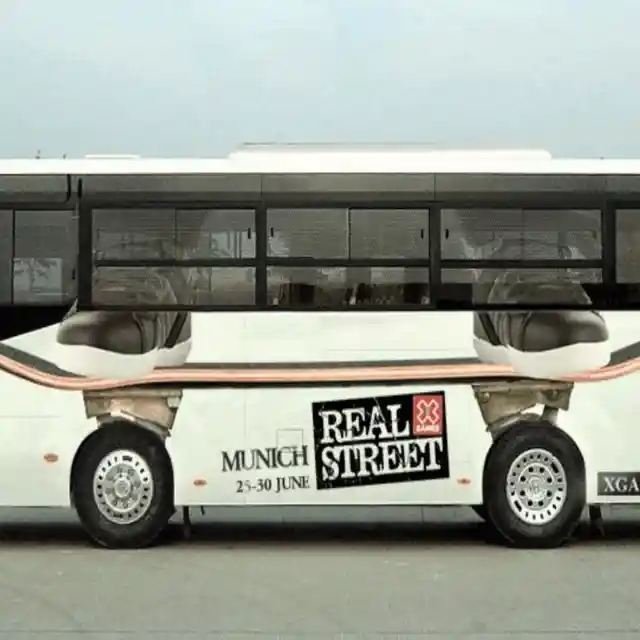
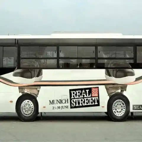
The advertisement is styled so that the wheels of the bus look like the wheels of the skateboard. In this way, when the bus moves, it gives the impression that the skateboard is moving also. Nice one!
See More Butts
A significant number of us are embarrassed or hesitant to go to the doctor for a colon and rectal test, yet it’s something that should be done to guarantee our health and wellness. The Colorectal Association of Canada hoped they could urge people to get their butts checked by a doctor through this funny ad.

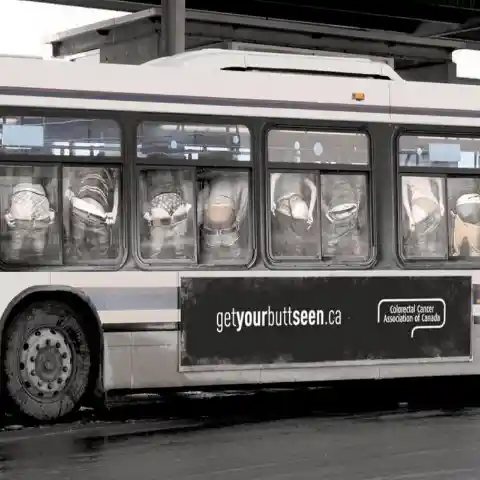
The bus advertisement was designed to disperse fear and shame by advising people to get their butts seen. Okay, we’re setting the appointments with our doctors now!
Go Nuts with Peanuts
Peanuts is perhaps the most famous comic strip ever made, and many of us know the characters since we’ve been seeing them since we were kids. When The Peanuts Movie was released in cinemas, the company decided to promote it on buses.
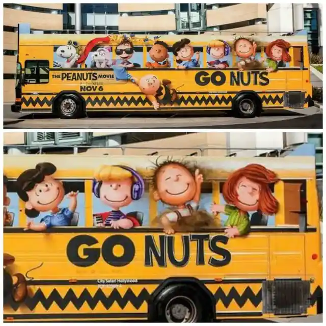
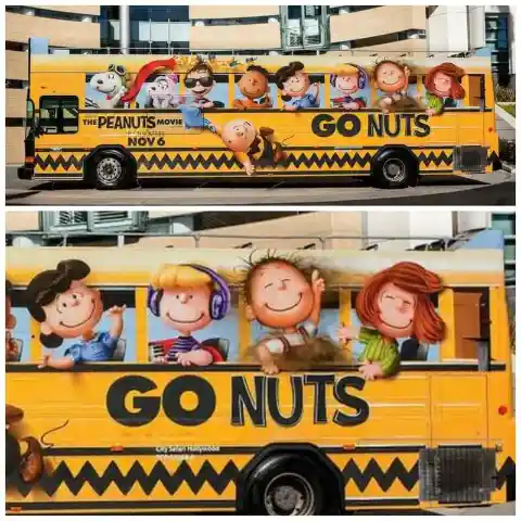
Since the characters are school-aged kids, it seemed only natural to transform the vehicle into a school bus, depicting all our favorite characters heading to class and having a great time. We'd say it's an extraordinary way to inspire excitement about the film.